Brand Identity, Strategic Direction & Visual System Development

Natural Intelligence Farming
Brand Identity, Strategic Direction & Visual System Development
Natural Intelligence Farming is a regenerative agriculture initiative founded on the belief that nature already holds extraordinary intelligence within its ecosystems when we choose to work alongside it rather than against it.
Built around the intricate relationships between soil, roots, microorganisms, livestock, biodiversity, and land stewardship, the project required a brand identity capable of communicating both scientific depth and human connection simultaneously.
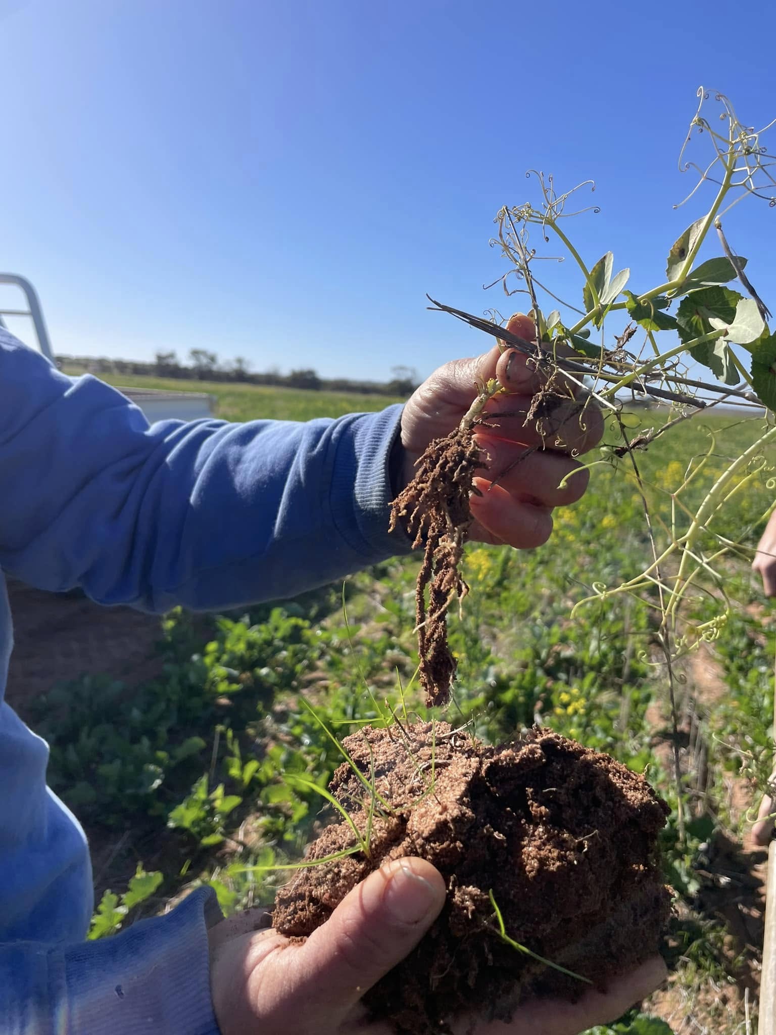
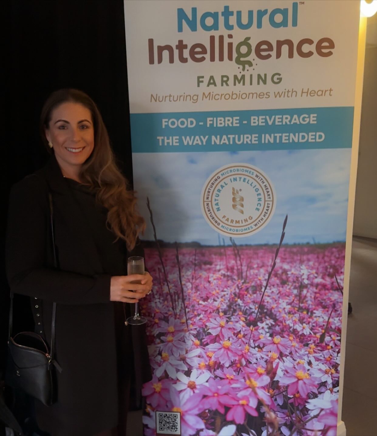
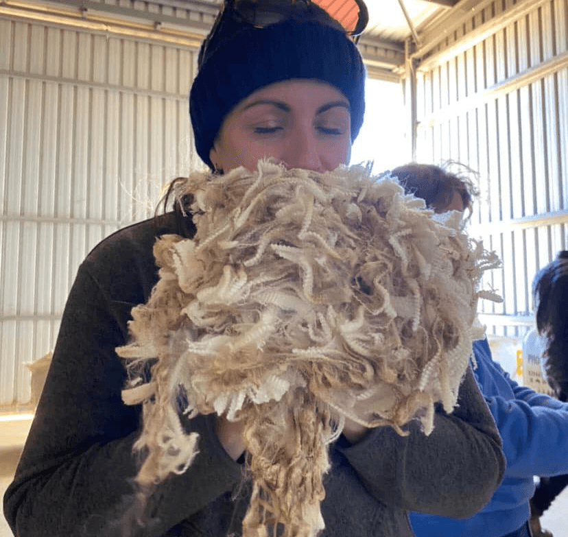
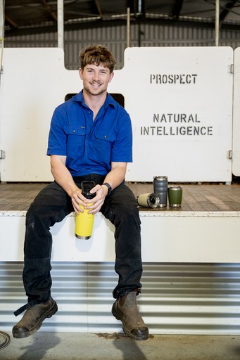
To better understand the philosophy behind the work, the project included visiting the family farm located within the Wheatbelt region of Western Australia. Spending time on the land and observing the regenerative processes firsthand became an important part of developing a visual system that felt genuinely aligned to the vision, values, and long-term ambitions behind the brand.
The outcome was a strategic identity system designed to support future growth, education, investment opportunities, community building, product applications, and broader communication across the regenerative agriculture space.
The branding system included:
Primary logo development
Wordmarks and secondary logo variations
Custom logo mark and monogram
Typography systems
Colour palette development
Brand textures and supporting graphic elements
Transferable production testing
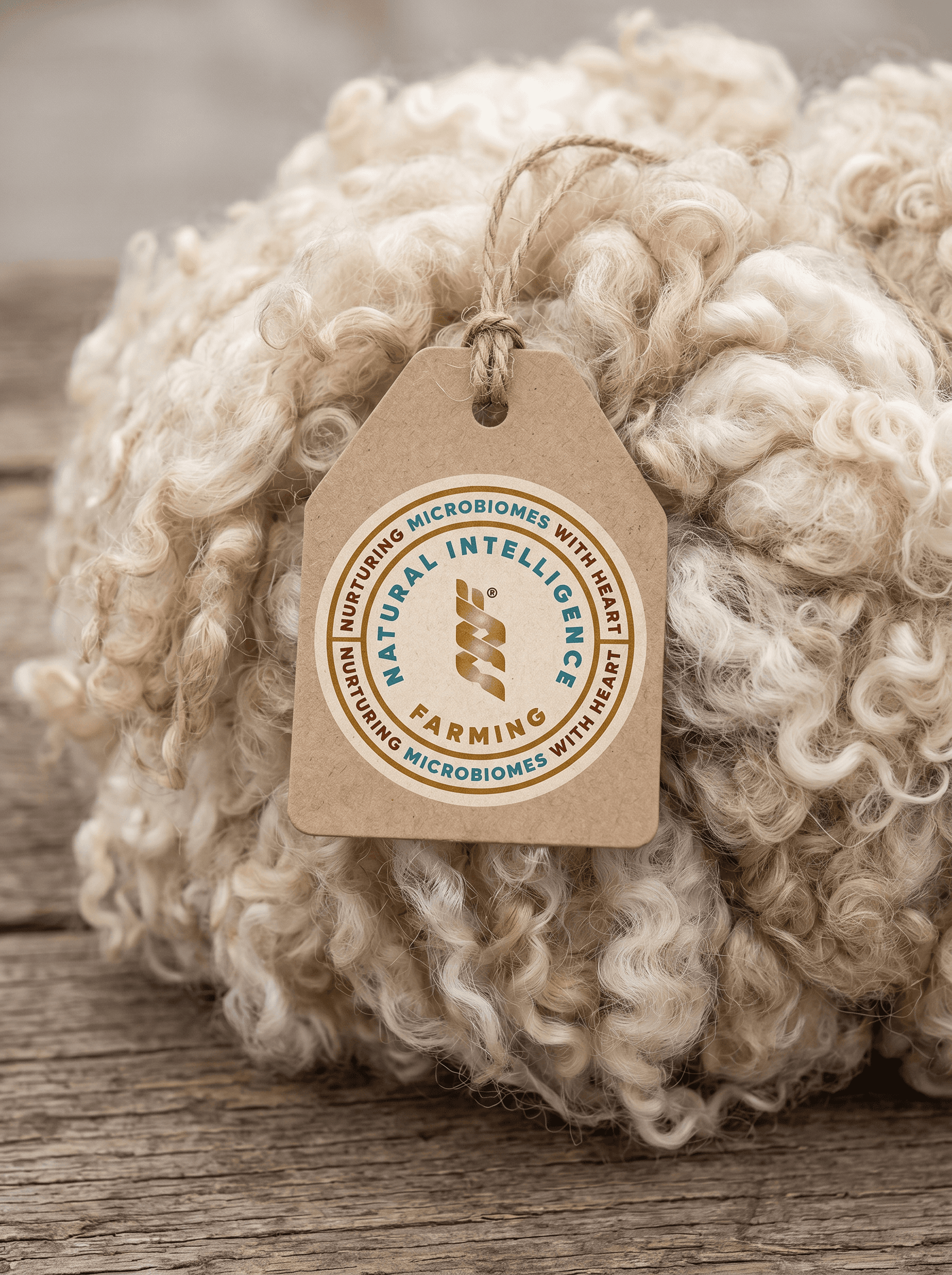
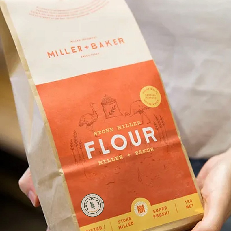
Visual mockups and applications
Brand messaging direction
Animation and motion concepts
Community and certification badge concepts
Digital asset considerations and favicon development
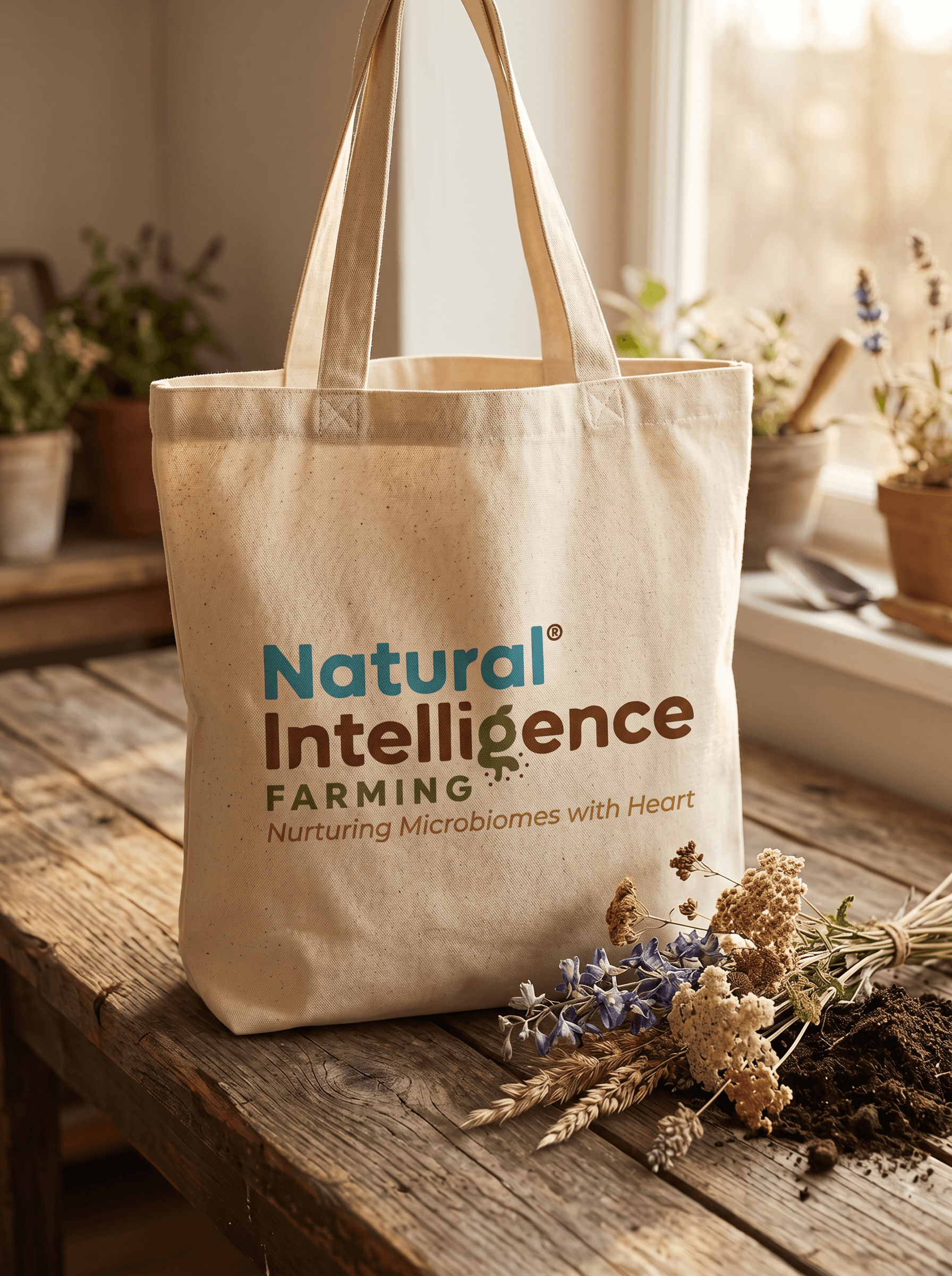
A key focus throughout the project was building a visual identity that balanced intelligence with warmth. The customised typography and interconnected brand elements were intentionally designed to reflect cyclical systems, microbiomes, regenerative processes, and the layered relationships found throughout nature itself.
The logo mark drew inspiration from epigenetic spiral structures and interconnected ecosystems, forming a monogram that symbolised the interwoven nature of regenerative farming principles and collective stewardship.

Rather than creating a surface-level agricultural aesthetic, the objective was to build a brand capable of carrying both educational authority and emotional resonance while remaining adaptable across future applications, partnerships, products, and digital platforms.
This project remains a strong example of the kind of work I’m most drawn to. Businesses and founders with a genuine long-term vision, deep belief in what they are building, and a willingness to think beyond conventional systems. Those projects often create the strongest creative outcomes because the belief behind the work becomes something shared.
Tash at Telling Designs was an absolute delight to work with! She went out of her way to get to know us and what our company stands for by coming out to our farm which meant a lot to us. Tash was able to fully captivate our companies values in her work and we couldn't be happier with the results! I highly recommend Telling Designs to anyone who is seeking a friendly and professional person to get the job done.
Matthew Haggerty
Founder of Orchid