Mission-Driven Brand Identity


Newman Community Centre Rebrand — Strategic Identity for Connection, Growth & Purpose
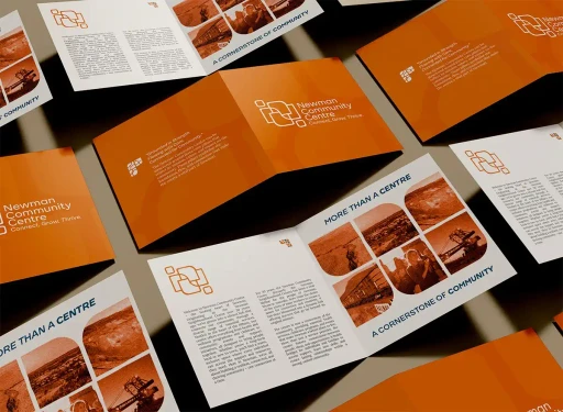
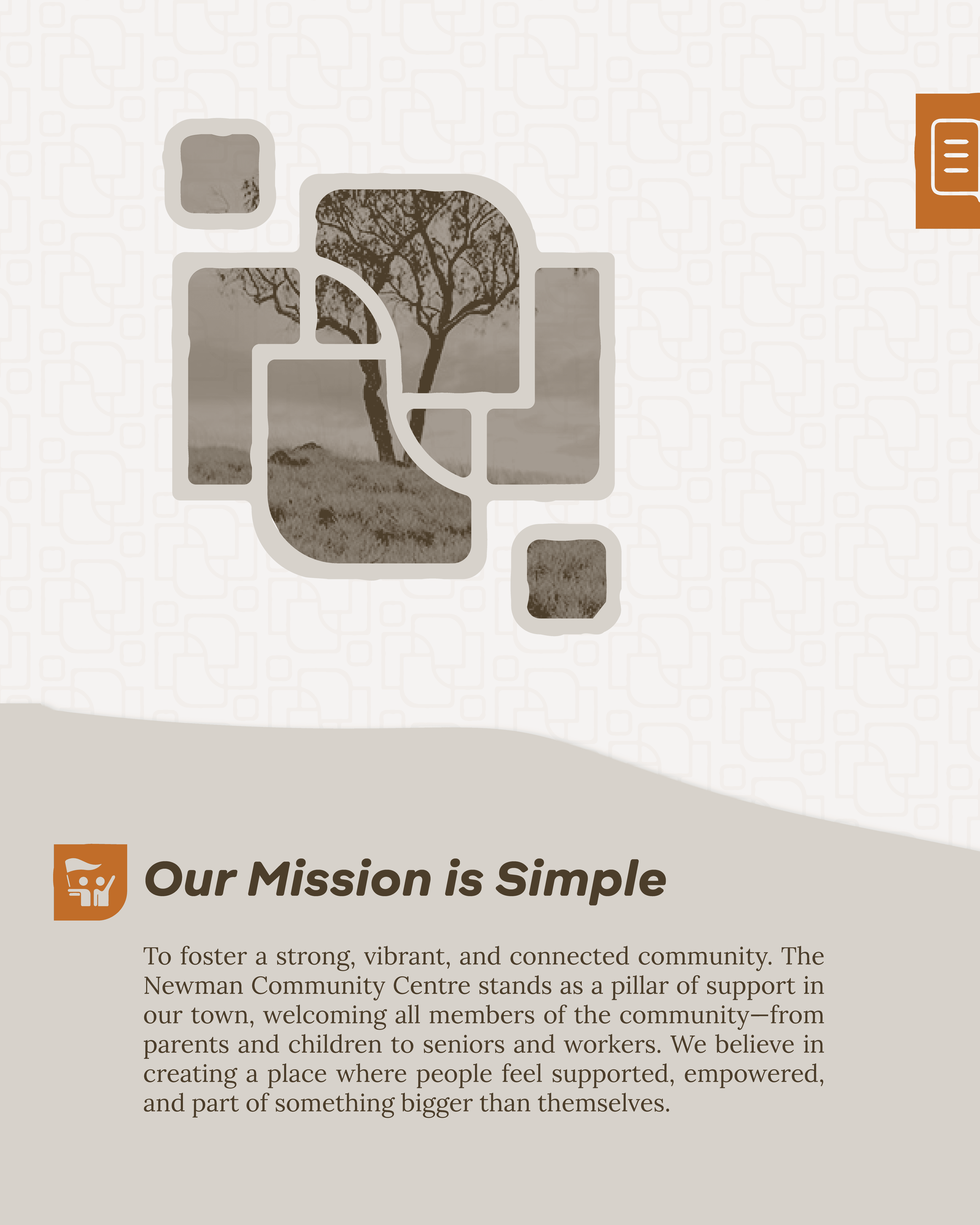
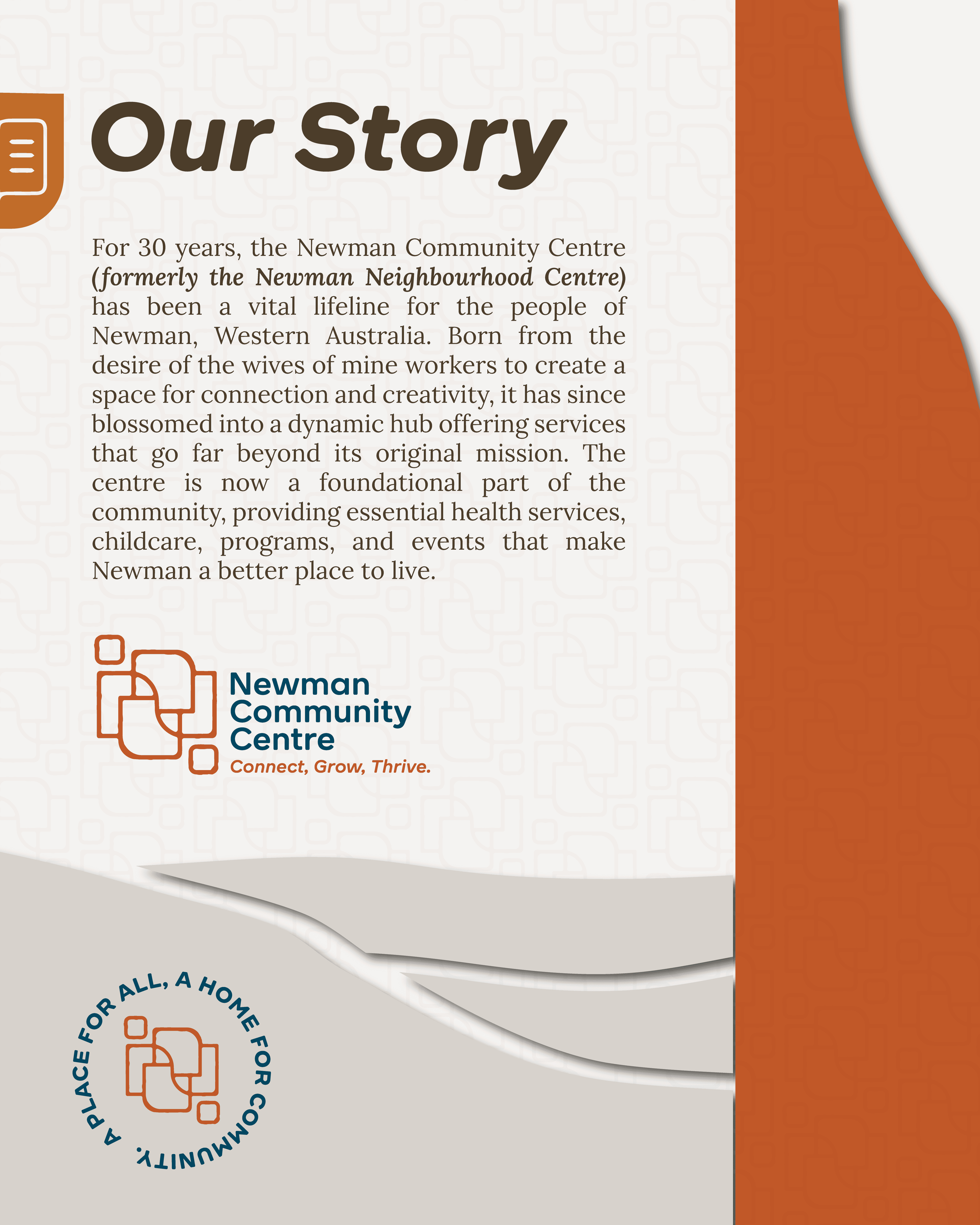
Newman Community Centre has been a vital community hub in Newman, Western Australia for over 30 years. Originally established by the partners of mine workers as a space for connection and creativity, the Centre has grown into a foundational organisation offering health services, childcare, community programs, and events that enrich local life. As part of its evolution and 30‑year celebration, the Centre commissioned a full brand refresh to better reflect its identity, values, and enduring role in the region.
The rebrand was rooted in community insight and strategic design thinking. The new visual identity balances structured forms with organic movement to symbolise both stability and connection — core roles of the Centre in an isolated town. Structured rectangles represent stability, organisation, and diverse services, while the flowing “N” shape evokes connection, life, and adaptability, much like a river sustaining a remote landscape. Smaller detached squares symbolise individuals linking together, reinforcing human connection and community relationships.
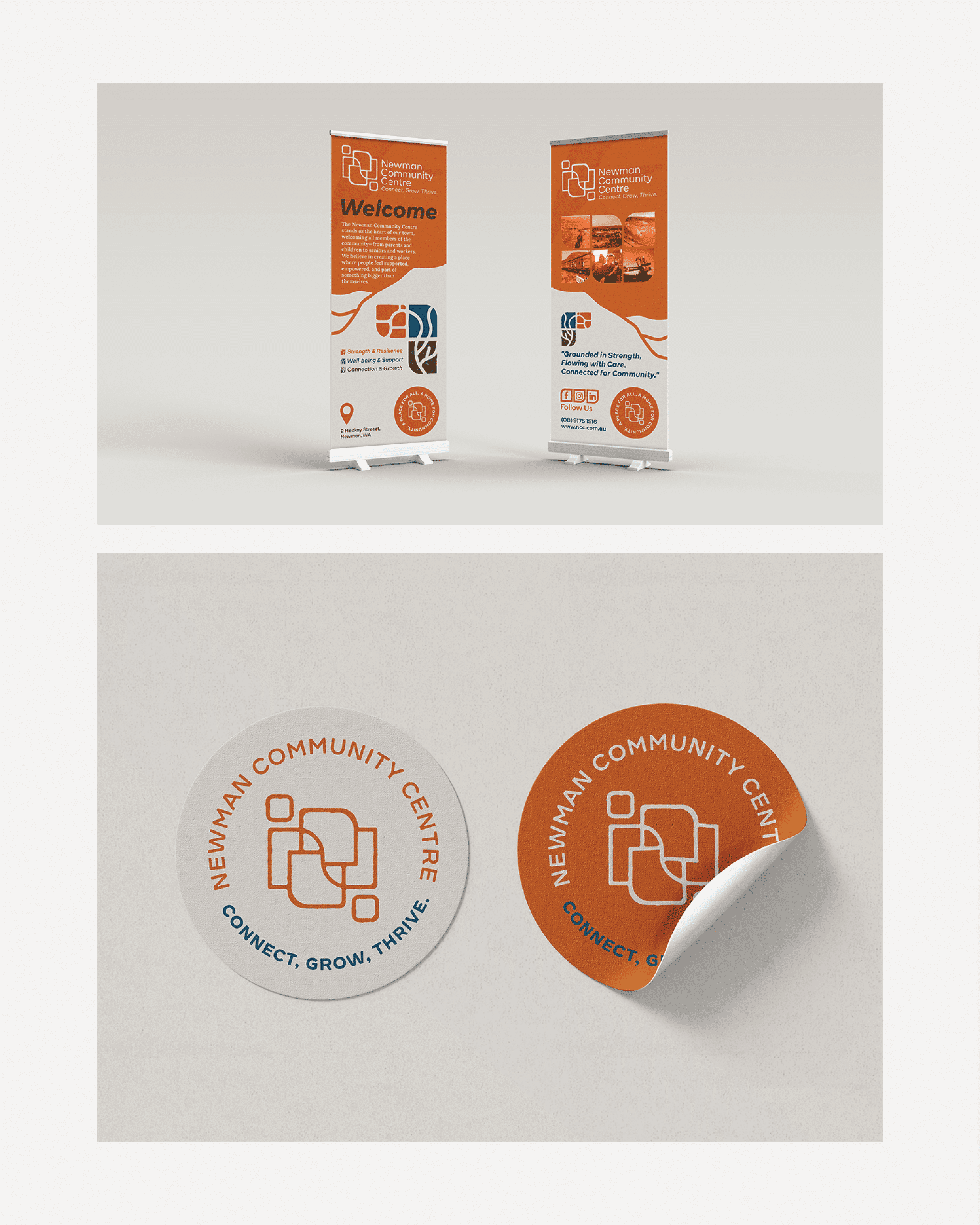
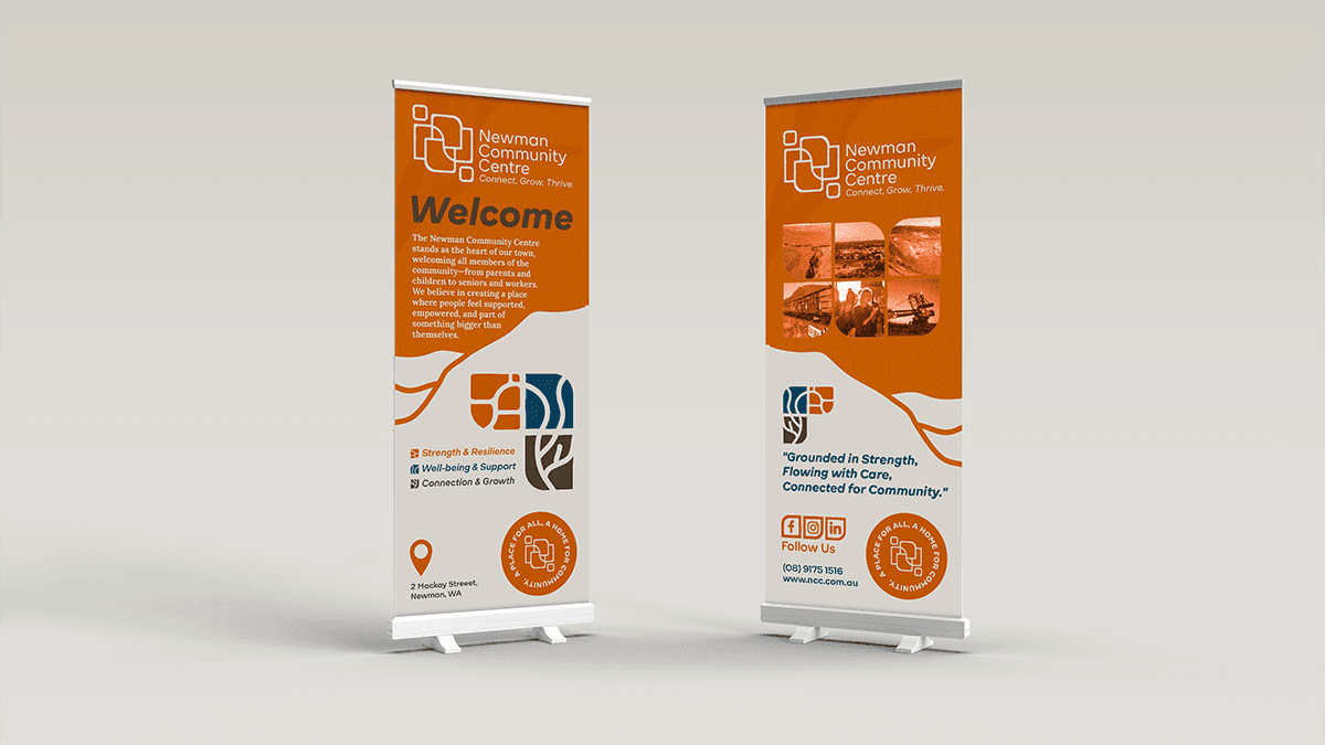
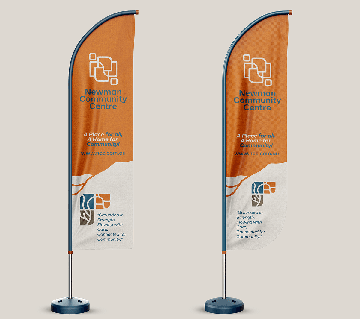
Warm, earthy colour tones reflect strength, resilience, and belonging, while clean modern typography communicates trust and professionalism. The primary logo anchors the identity with a bold, recognisable mark that resonates across digital, print, signage, and collateral. Custom brand patterns featuring quokkas, local flora, and community icons create an engaging visual language that brings warmth and personality to the brand, ideal for marketing collateral, merchandise, and strategic communications.
The resulting rebrand is inclusive, uplifting, and deeply rooted in place, reflecting the Centre’s mission to foster a strong, vibrant, and connected community. By strategically aligning visual identity, symbolism, and tone of voice, the new brand helps the Newman Community Centre communicate its purpose clearly, stand out as a trusted community partner, and inspire connection and growth across all audiences.
A rebrand with heart for a centre that truly deserves it.

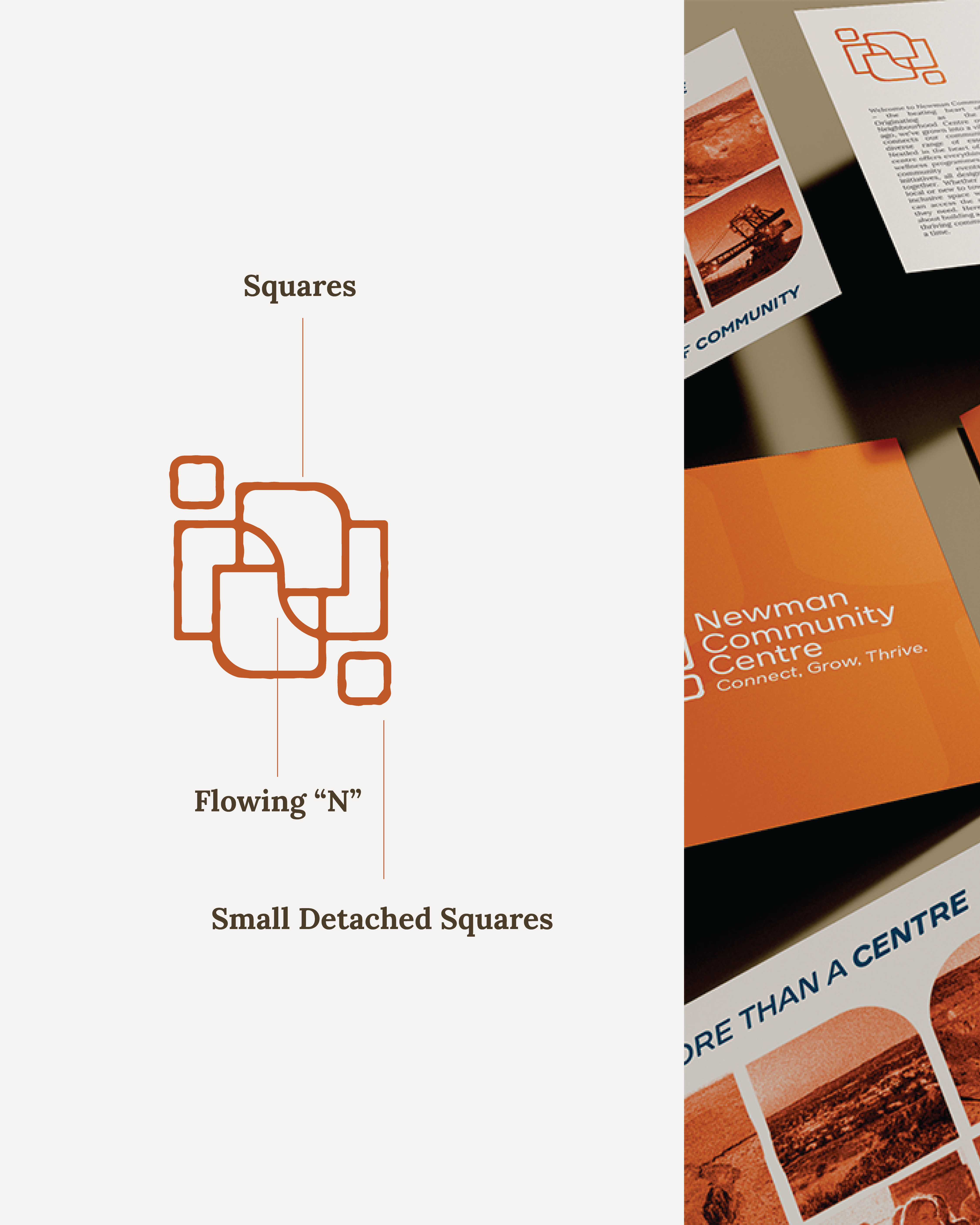
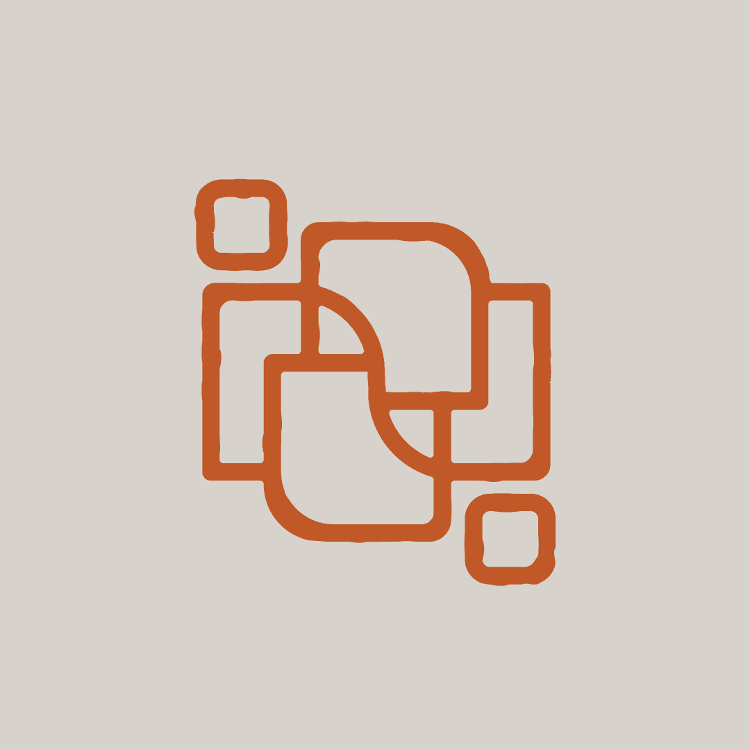
ABOUT THE LOGO
The Newman Community Centre’s visual identity is built on the interplay of structured rectangles and a flowing “N,” creating a design that reflects both stability and connection — core to the centre’s role in an isolated region.
Symbolism & Meaning
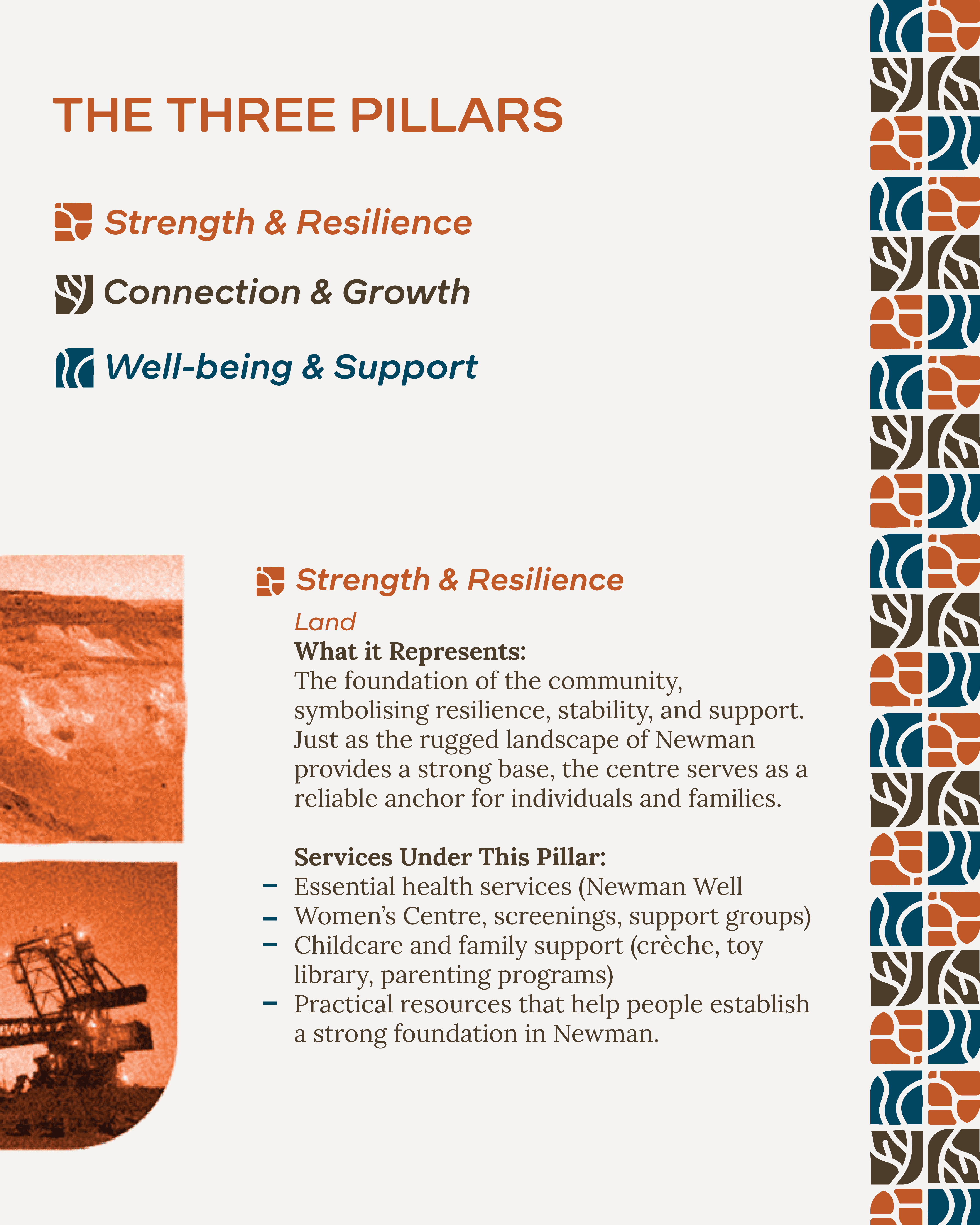
Squares: Represent stability, organisation, and structure, symbolising the diverse services and resources the centre provides. They also reflect a strong foundation within the community.
Flowing “N” (River Symbolism): Represents connection, adaptability, and life — a metaphor for how the centre unites people, nurtures growth, and supports those navigating life’s challenges. Like a river sustaining life in a remote landscape, the centre is a lifeline for Newman.
Small Detached Squares: Symbolise people linking arms, visually reinforcing the idea of human connection and the relationships built within the community. These elements add warmth and inclusivity to the structured design.
Contrast Between Structure & Flow: The geometric rectangles paired with the fluid “N” create a balance between order and movement, reflecting both the dependability of the centre and its ability to evolve with the community’s needs.
Rough Edges & Organic Forms: Inspired by Newman’s rugged landscape and resilient spirit, the design’s intentional imperfections reflect the town’s raw, real, and unpolished nature. This authenticity ensures the brand identity remains deeply connected to its surroundings.
This identity captures the essence of the Newman Community Centre — structured yet welcoming, dependable yet adaptable, and above all, a place where people come together.
Natasha is fantastic to work with. Her ability to understand the requirements of our organisation and work with us to build a strong brand presence was great. She took everything we gave her and executed it perfectly.
Peta Baer
CEO