
Re-brand/Market Positioning


About the Client
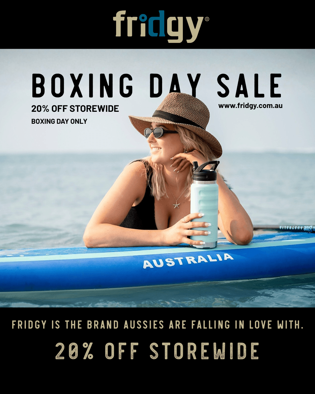
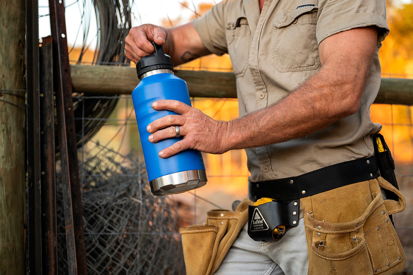
The client operates within the reusable drinkware and lifestyle product space, designing high-quality stainless steel products built for durability, practicality, and everyday performance.
When the business first engaged Telling Designs, the ambition was much bigger than the brand itself.
The founder had a vision to build something that could compete nationally within an increasingly saturated market, but the business lacked the strategic foundations required to support that level of growth. There was no clear positioning, no defined audience, limited differentiation, and no cohesive brand system capable of scaling beyond its early stages.
The biggest challenge was not simply creating a logo or visual identity.
It was identifying where the brand could hold meaningful space within the market against far larger and more established competitors.
The Challenge
At the time, the business lacked:
a clear target audience
strategic positioning
distinct market differentiation
cohesive communication
consistent visual identity
scalable brand infrastructure
The existing brand assets did not reflect the quality, ambition, or long-term direction of the business. More importantly, there was little strategic clarity around who the brand was truly for, what emotional space it wanted to occupy, and how it could compete beyond product functionality alone.
Without solving those foundational gaps first, national growth would have been difficult to sustain.
Strategic Direction & Brand Development
This engagement became far more than a standard branding project.
Telling Designs worked closely with the business from the ground up, helping shape not only the visual identity, but the wider perception, communication, rollout, and strategic direction of the brand as it evolved into a nationally recognised business.
The work included:
strategic positioning and market analysis
identifying audience gaps and differentiation opportunities
refining brand direction and communication
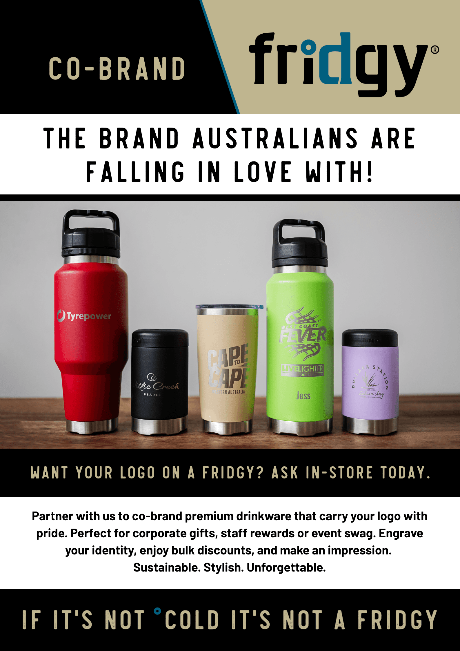
product and collection naming input
visual identity system development
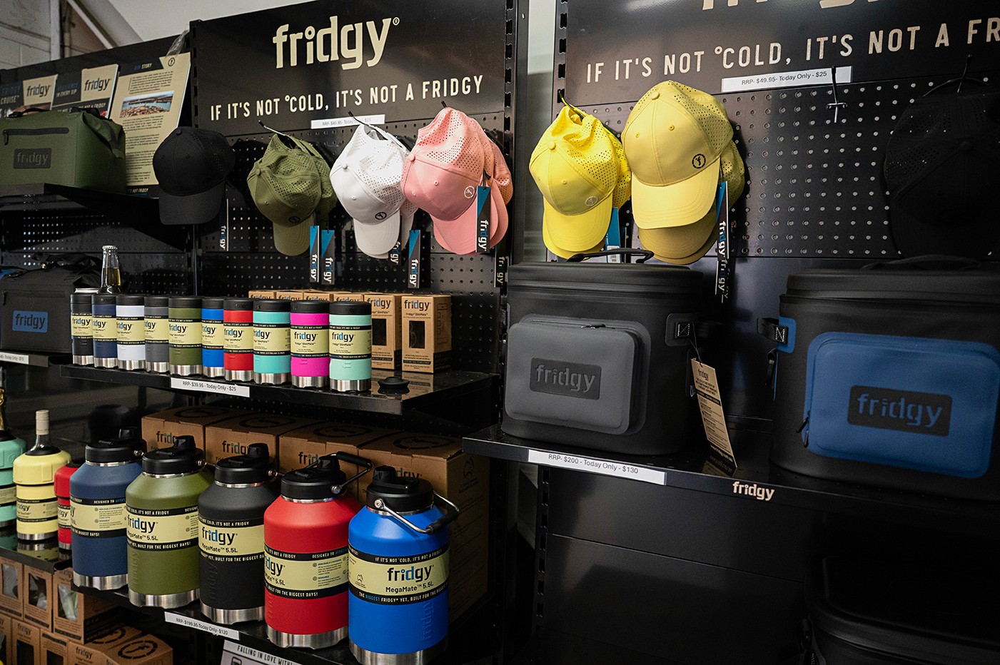
packaging and label systems
campaign direction and rollout
product descriptions and communication refinement
website communication, structure, UI and UX direction
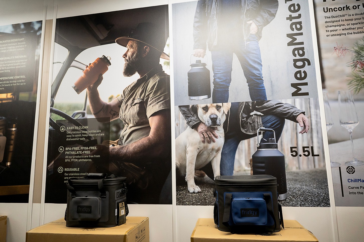
photography creative direction and production oversight
coordinating models, shoot logistics, styling, and locations
sales representative support materials
editorial campaigns and launch collateral
ongoing brand guardianship and strategic oversight
Every touchpoint was intentionally developed to strengthen consistency, positioning, and long-term market recognition as the business scaled.

Outcomes & Growth
Since the rebrand and strategic repositioning, the business has successfully evolved from a regional product-based company into a nationally recognised brand with a far stronger market presence and clearer audience alignment.
The refined positioning created stronger differentiation within the category, allowing the brand to move beyond functionality-led marketing and build stronger emotional connection, recognition, and perceived value within the lifestyle and everyday carry space.
The new brand system was rolled out across packaging, digital platforms, retail touchpoints, campaigns, and product launches, creating consistency across the wider business ecosystem as the company expanded nationally.
The website experience and communication strategy also underwent significant refinement, contributing to conversion rate growth from approximately 1.5% to 3.5% on average through improved clarity, user experience, positioning, and communication flow.
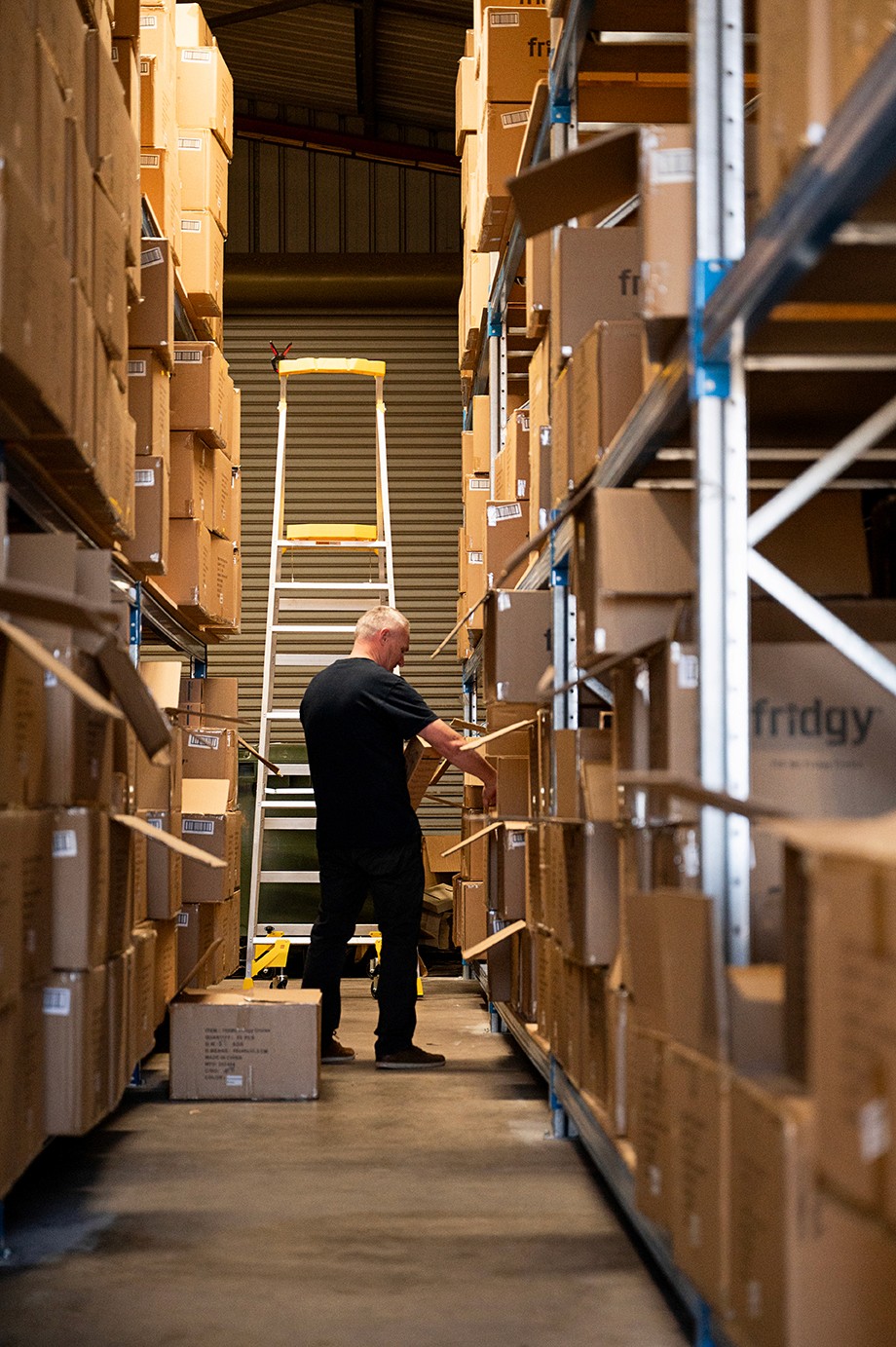
Today, the business continues to expand its national presence supported by ongoing strategic direction, content creation, campaign development, and brand guardianship through Telling Designs.
This project reflects the depth of involvement Telling Designs often takes within scaling brands, operating not simply as a design provider, but as a long-term strategic and creative partner invested in the growth, positioning, and evolution of the business over time.