
Re-brand Strategy, Identity Design, Photography, and Positioning

The Denmark Chocolate Company
Brand Strategy, Identity Design, Photography, and Positioning
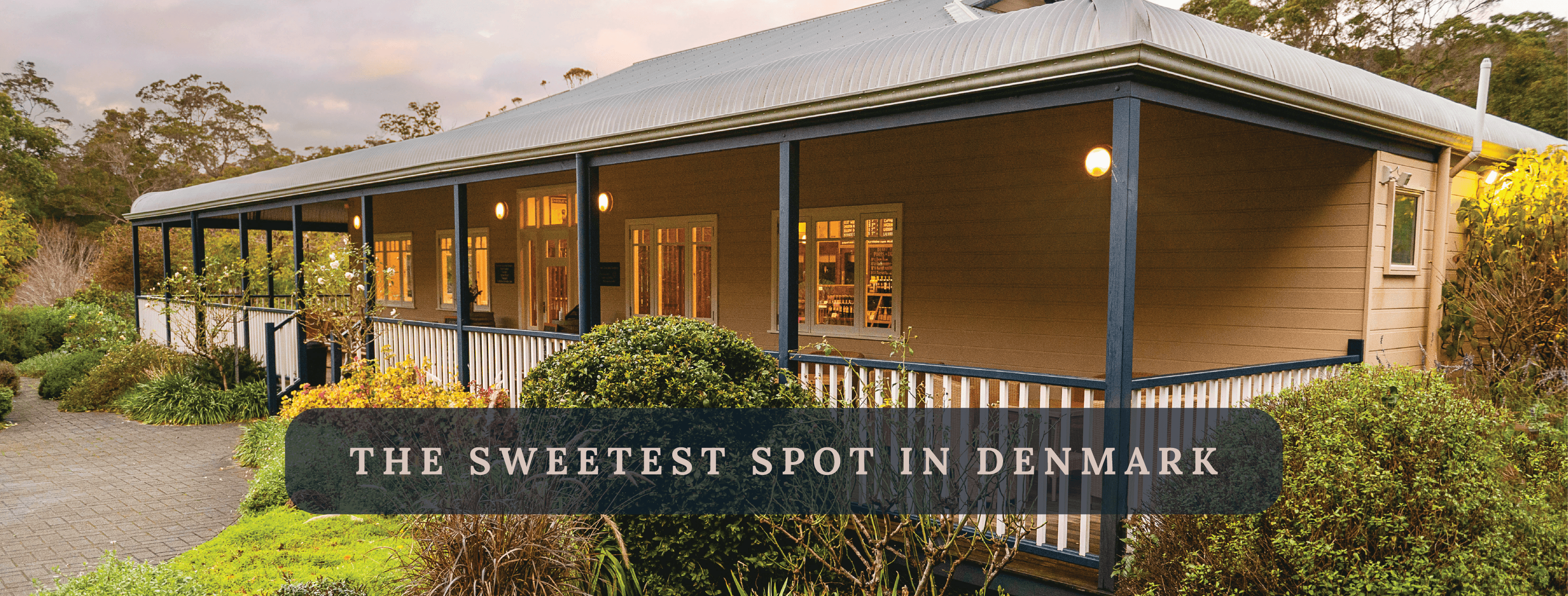
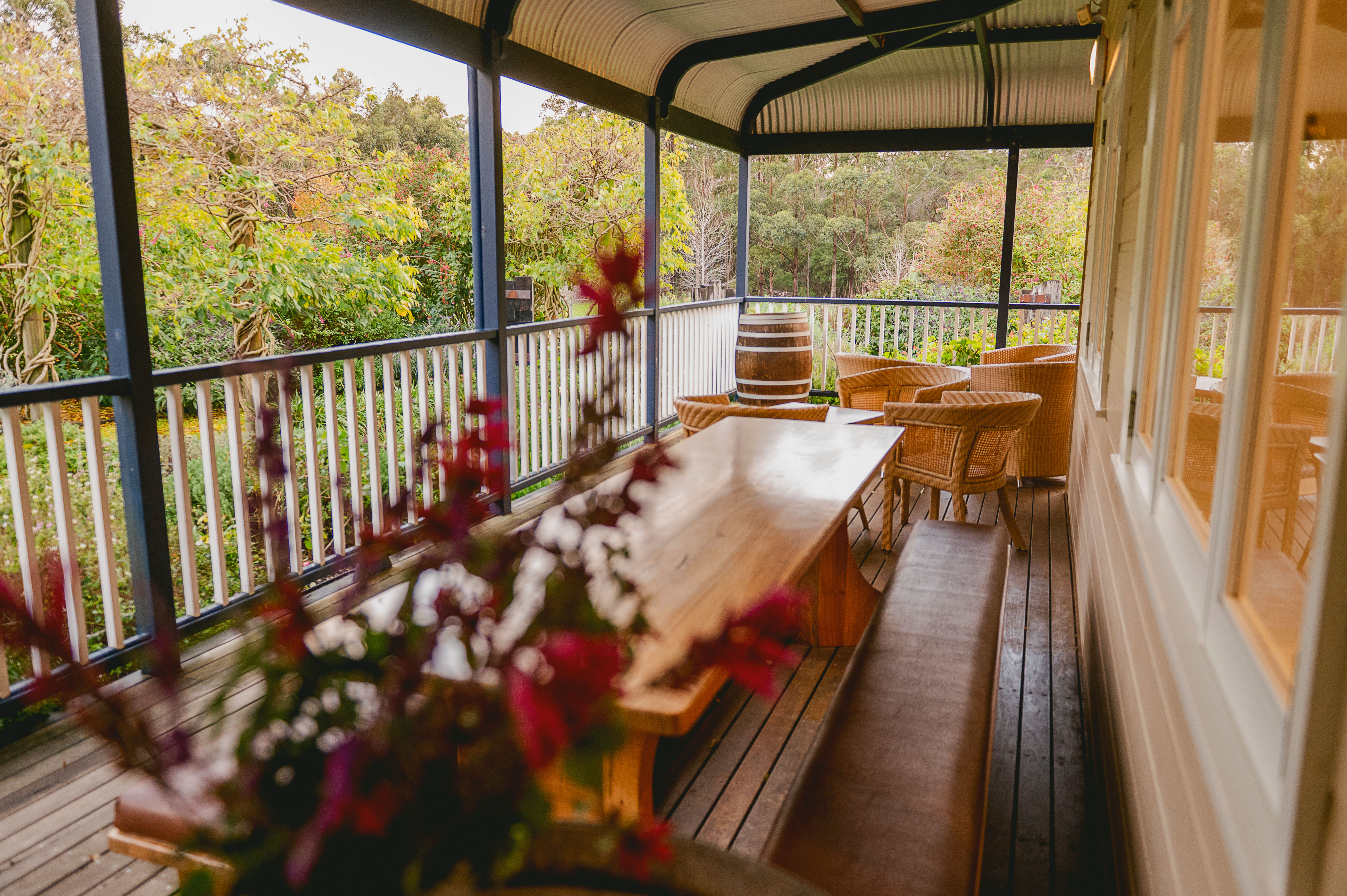
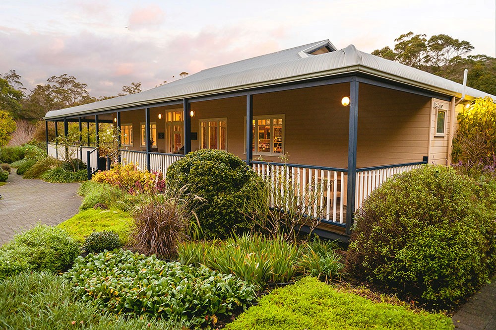
Located in the heart of Western Australia's red tingle forest, The Denmark Chocolate Company is more than a chocolate shop — it's a destination brand with a deep connection to place, heritage, and sensory experience. This rebrand was not just about updating visuals. It was a strategic repositioning to elevate the business into a high-end, recognisable brand system capable of drawing both loyal locals and curious travellers.
A Strategic Rebrand Rooted in Story
The original branding no longer reflected the level of product quality, customer experience, or the unique setting of the business. We began by clarifying the brand’s positioning — a nature-led, luxurious experience set in one of WA’s most beautiful garden landscapes. From there, we developed a layered identity system designed to support packaging, signage, marketing, and in-store storytelling.
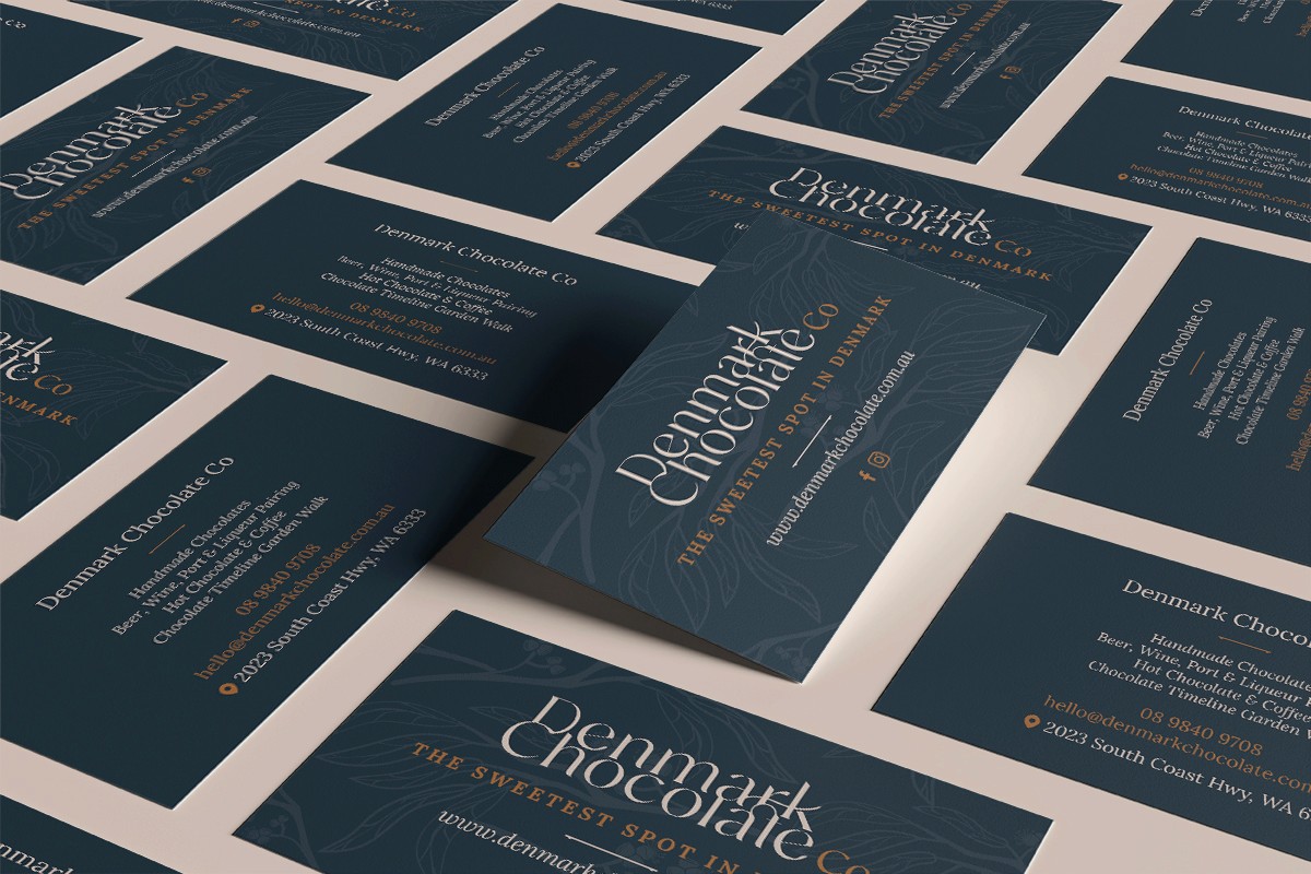
This included:
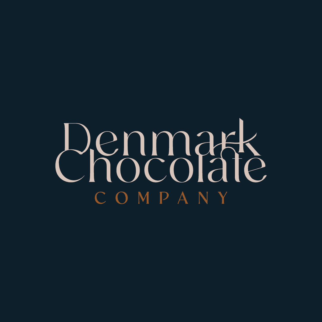
A primary logo to anchor the brand across major channels
A wordmark optimised for clarity and elegance
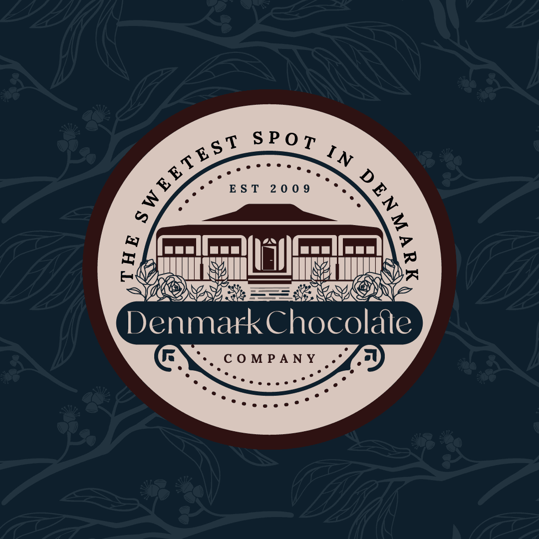
A refined logo mark, used across merchandise, packaging, and social assets
A rich, nature-inspired colour palette grounded in local landscape references
Fully styled photography and content direction to create brand consistency
Design That Reflects Place and Product
The visual identity draws from the business’s environment and experience. Deep forest green echoes the surrounding trees, dust pink references the garden flora, golden orange evokes luxury, and chocolate brown ties directly to the product. Paired with refined serif typography, the result is an identity that feels handcrafted, established, and premium.
A Commercial Outcome
Since the rebrand, The Denmark Chocolate Company has reported a 20% increase in revenue within the first year, attributing the lift in part to improved visibility, stronger brand perception, and more consistent storytelling across touchpoints. The brand now sits confidently within WA's high-end icon house style destinations — recognised not just for product, but for place and experience.
Marketing Direction: Invite Curiosity
To support ongoing growth, the brand is now positioned as a destination worth discovering. One of the strategic content pillars focuses on "Come for curiosity, stay for chocolate." This narrative invites exploration, playing off the immersive gardens, forest setting, and high-end product range — making it ideal for weekenders, tourists, and locals alike.
Strategic rebrand and identity rollout for The Denmark Chocolate Company (denmarkchocolate.com.au), a heritage chocolate business in Western Australia’s south coast. The new branding increased revenue by 20% in its first year and positioned the business as a high‑end destination brand.